Serif or Sans Serif for a Printed Page?
Serif or sans serif for a printed page? Compare their visual character, reading feel, and layout needs to choose type that supports the page’s purpose.
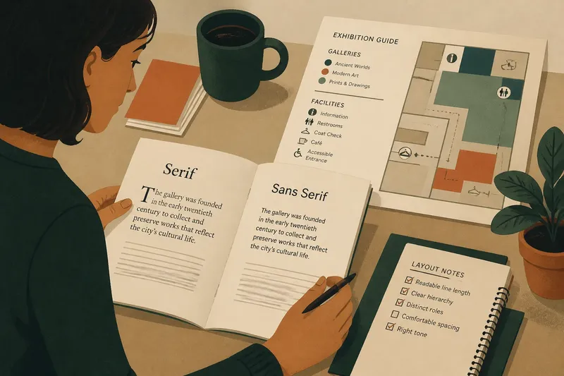
Serif or sans serif for a printed page? The choice changes how a page feels before a reader reaches its first sentence: serif letters carry small finishing strokes, while sans serif letters do not. Neither style is automatically easier to read. The better fit depends on the text, the size and shape of the page, and the job the typography needs to do.
What does each type style communicate?
A serif typeface has small strokes attached to the ends of many letterforms. In a familiar book face, those details can give paragraphs a textured, continuous appearance. Serifs may suggest formality, tradition, or literary seriousness, though those associations depend on the specific design and its context.
A sans serif typeface lacks those finishing strokes. Its forms can look direct, open, or contemporary, but sans serif is not one uniform style: a geometric face with round shapes feels different from a humanist face with more varied proportions. The label describes a feature, not a complete personality.
Both categories include typefaces designed for extended reading and others better suited to brief labels or display text. A distinctive headline face may attract attention but become tiring in a long passage. Judge the actual typeface, not only its category name.
How does the page change the reading feel?
Printed reading depends on more than the shape of individual letters. Type size, line length, spacing between lines, ink darkness, paper, and surrounding white space all affect how easily readers can follow a passage. A comfortable face can still feel cramped if lines run too long or paragraphs sit tightly together.
Serifs can help distinguish parts of letterforms and give a line of text a finely articulated texture. Some readers associate that texture with books and essays. Sans serifs can offer simpler outlines and a more open impression, particularly in short blocks, labels, or layouts with strong visual hierarchy. These are tendencies, not rules: a well-made sans serif can work for sustained prose, and a serif can feel clear in a compact leaflet.
Paper and printing also matter. On uncoated stock, the edges of small letters may appear softer than they do on smooth paper. A thin typeface may lose definition in a dense passage, while a very dark face can make the page look crowded. Consider the actual print conditions and follow the typeface maker’s and printer’s specifications when they apply.
Which style suits which kind of page?
- Books and long essays: A text-oriented serif can create a familiar, measured page, while a carefully chosen sans serif may suit a contemporary voice or a layout with generous spacing. Prioritize sustained comfort and a readable line over convention.
- Instructions and reference sheets: Either style can work. Clear distinctions between headings, labels, and body text matter especially here, since readers may scan for a specific action rather than read from beginning to end.
- Posters and short notices: A sans serif often gives brief wording a direct, uncluttered presence. A serif can add character or formality when that tone fits; keep decorative details from competing with the message.
- Mixed editorial layouts: Pairing a serif for body copy with a sans serif for headings can separate roles without adding many typefaces. The reverse can also work when the display type is restrained and the body face remains easy to follow.
For a familiar printed novel, a reader may expect a calm, continuous texture. For a museum handout with short sections, maps, and captions, a sans serif might make labels feel at home beside the graphics. Purpose should guide the choice, not a belief that one style belongs to every kind of print.
How can you choose type for a printed page?
Start with the reader’s task. Someone following a continuous argument needs a stable reading rhythm; someone consulting a program or menu needs to locate details quickly. Then look at the page’s physical conditions: its format, likely viewing distance, amount of text, and the contrast between type and paper.
Imagine you are laying out a neighborhood exhibition booklet with short curator notes, object labels, and a small map. You choose a readable serif for the notes to give them a steady texture, then use a plain sans serif for labels and map keys so those brief elements feel distinct. A printed draft would let you see whether the pair separates the roles clearly without making the booklet feel divided.
When possible, assess a sample at its intended printed size rather than relying only on a screen. Check whether letters remain distinct, whether the line length feels manageable, and whether headings stand apart without shouting. If a paragraph feels dense, adjust the measure, spacing, or size before assuming the type category is the problem.
What should you compare before deciding?
- Text length: Is the typeface designed to hold attention across paragraphs, or does it work best in short bursts?
- Letter clarity: Can readers distinguish similar shapes at the intended size, especially in names, numbers, and labels?
- Line and paragraph texture: Do the words form an even, comfortable field, or do spacing and weight make the page seem crowded?
- Hierarchy: Can a reader tell body text, headings, captions, and navigation apart without mistaking decoration for importance?
- Tone: Does the type’s character suit the material without distracting from what the page says?
- Print conditions: Do the chosen weight and details stay clear on the paper and through the printing process you intend to use?
What do readers often ask about serif and sans serif?
Are serif fonts easier to read in print?
Not as a universal rule. A suitable serif can support a familiar reading rhythm, but type size, line length, spacing, contrast, and the specific design also shape comfort.
Can a sans serif work for a printed book?
Yes. Choose one with clear letterforms and a texture that remains comfortable across paragraphs, then assess it in the book’s actual layout rather than judging from a heading sample.
Can I use both styles on one page?
Yes, when each has a clear role, such as one for body copy and the other for headings or labels. Keep the pairing coherent so the page reads as one system rather than a collection of unrelated choices.
Should the same typeface be used throughout a publication?
Consistency helps readers recognize recurring elements, but different sections may need distinct roles. A small, deliberate type family can provide variation while keeping the page’s hierarchy understandable.
What is the clearest way to make the choice?
Choose the face that serves the reader’s task and the page’s tone, then judge it in context. If the work is continuous prose, pay close attention to paragraph texture; if it is a scanning-oriented page, make labels and headings easy to locate. Serif or sans serif for a printed page is not a vote for a universal winner. It is a decision about which visual voice helps this particular page do its work.
Keep the comparison focused: try one suitable serif and one suitable sans serif in the same layout, at the same size and with the same spacing. That makes their differences easier to see and prevents a change in layout from disguising what the type itself contributes.